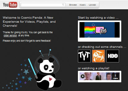
Youtube has come up with a new experimental redesign that is code named Cosmic Panda. This interface is a whole lot different from the current interface. It looks sleek, clutter free and cleaner. The new Cosmic Panda interface Is elegant and pleasing to the eye.
 Cosmic Panda is a total makeover to Youtube’s older interface from top to bottom. The first thing you’ll notice is that the all too prevalent whitespaces have been minimized a lot. The videos are set in a black background. The thumbnails that appeared on the sidebar are now larger and look better. On the playlists, the thumbnails now show up immediately.
One cool thing about Youtube’s Cosmic Panda interface is that you can now quickly switch between three different video sizes besides the full screen mode. Cosmic Panda also offers many options for customizing the channels. You have four different templates for channels in Cosmic Panda. Other videos from the same uploader now appear just beneath the video player. Another cool thing is that you can now replace the comments section with suggested videos by clicking the Suggested Videos Tab next to the comment tab. The Suggested Videos by default appear at the sidebar but if you want to see more of them, the tab lets you see a bunch of them right in the comment area.
You can return back to the older version of Youtube by clicking on the older version link on the Cosmic Panda page. Youtube’s Cosmic Panda Interface is a total makeover given to Youtube’s interface and is more user-friendly and appealing.
